
Local Link
My first ever design project: designing an End-to-end application to help people who have moved to a new city find things to do.


Project Overview
Background
Moving to a new city can feel exciting yet isolating. Many people struggle to find reliable local recommendations and opportunities to connect with others who share their interests. Existing tools like Facebook groups or event apps often feel cluttered, impersonal, or time-consuming to navigate.
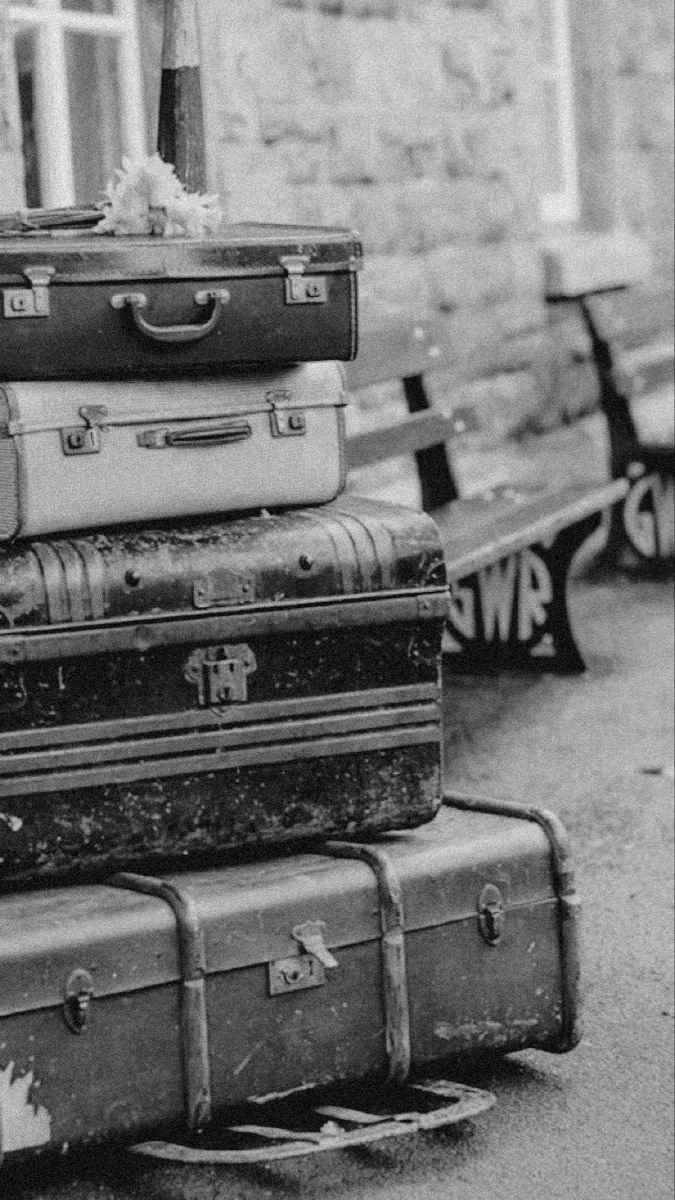
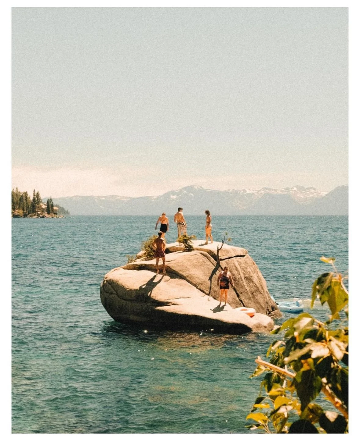
I began this project by researching the moving experience as a whole; from the early stages of packing, to the transition of traveling, to the adjustment period after arriving. This helped me understand the emotional journey and identify opportunities to support users beyond logistics, focusing on building community and a sense of belonging once they’ve settled in. Local Link is a mobile app concept designed to help newcomers quickly discover things to do, connect with others, and feel at home in their new city. The goal was to create an intuitive, community-focused experience that makes exploration effortless and social connection natural.
Project: End-to-end application, first ever design project
Role: UX/UI designer, brand designer
Problem
People who move to a new city often feel disconnected and overwhelmed trying to find trusted local recommendations or meet people with similar interests.
Solution
Local Link streamlines the process of discovering local activities and communities through personalized suggestions, curated events, and connection features that make integrating into a new city simple and enjoyable.
The problem: People move for a variety of reasons and it can be incredibly stressful.
Many people experience different behaviors before, during, and after a move.
What is Local Link?
Local Link is a platform designed for people who have moved to a new city to ease the process of trying to find things to do and meet new people based on their interests.

The Design Process
-
Competitor Analysis, User Interviews, Affinity Map
-
Storyboard, User Persona, Project Goals, Problem Statement, Feature Set
-
Card Sorts, Sitemap, User Flow, Hand Sketches, Low-fidelity Wireframes, Moodboard, Brand Style Tile, Logo, High-fidelity Mockups
-
Low-fidelity Prototype, Final High-fidelity Prototype
-
User Testing, Usability Test Plan, Usability Test Results
-
Iterations, Reflection, Next Steps
Competitor Analysis, User Interviews, Affinity Map
Research

Discovery Research Goal:
We want to know what specific topics in moving stress users out or cause a problem so that we can make the process easier and more organized by improving their lives.
The Problem:
Moving to a new place can be overwhelming, unorganized, and stressful. Users may need more help than they currently have, or more information on the area they are moving to.
Competitor Analysis
To better understand the market of four different moving companies, I compared Updater, TaskRabbit, MyMove, and MoveAdvisor. The overall hypothesis at this time was that users’ main issue would be: affording movers/the process
User Interviews + Affinity Map
5 participants ages 24-29
all moved out of state
important quotes and data pulled from user interviews to make an organized affinity map with different themes
-
![]()
Kat (24)
Moved from TN to Chicago
-
![]()
Alexis (27)
Moved from Kansas City, MO to Memphis, TN
-
![]()
Becca (29)
Moved from Memphis, TN to Scottsdale, AZ
-
![]()
Brooke (23)
Moved from Birmingham, AL to Memphis, TN
-
![]()
Nicholson (
Moved from Memphis, TN to Detroit, MI


Results
5/5 participants struggled with finding things to do/people to meet somewhere they never lived
Unveiled real life problems people face who have moved out of state
Key insights: Having a way to connect with people and find information from locals about the area people are moving to, would improve the moving process by relieving certain nerves and anxieties of the unknown

Storyboard, User Persona, Project Goals, Problem Statement, Feature Set
Define
Who is Local Link for?
I created Newcomer Nellie as my user persona to represent users who have recently moved to a new city and struggle to find ways to connect and explore. This persona helped guide design decisions by keeping the focus on simplicity, community connection, and personalized discovery.
Estimated Hypothesis
I’d like to explore ways to help people who have moved to a new city where they don’t know anyone or where anything is, to find a sense of community, because the people I interviewed struggled with this and it might improve stress and anxiety.
HMW
How might we improve the process of making friends in adulthood?
How might we create a sense of community somewhere someone doesn’t know anyone?
How might we use social media to connect people in the same area to create friendships?
From Lost to Local: Discovering Things to do in a New City
Storyboard
Moving to a new city can be overwhelming, especially when trying to find things to do and meet new people. This storyboard illustrates how Nellie uses Local Link to discover activities, connect with like-minded individuals, and feel at home in her new environment.
Project Goals
USER GOALS
Build a sense of community
Ease anxiety
Feeling safe and secure when chatting with strangers
Exploration of a new city
Discover places to eat, workout, things to do
Meet new people
Easier way to meet people and have information about what the city offers all in one
BUSINESS GOALS
Maintain and increase customer lifetime value by building a sense of community for customers to share experiences and provide feedback
Provide a social sharing options for users to spend time on the app browsing
Provide connections to others through messaging and common interests and joining groups within communities
Use push notifications to remind users to return to the app to increase user engagement time on the app
Feature Set
-

Must Have
Account Creation: Sign Up/Profiles, Search, Privacy/Security, Notifications/Reminders, Log In
-

Nice to Have
Language, Explore Page, Messaging, Social/Activity Page
-

Surprising & Delightful
"Recommended For You" Page, Customizable Profiles, City Services/SafetyMaps. "Advice From a Local", Volunteer Opportunities
-

Can Come Later
FAQ, About page
Card Sorts, Sitemap, User Flow, Hand Sketches, Low-fidelity Wireframes, Moodboard, Brand Style Tile, Logo, High-fidelity Mockups
Design
Card sorts + Sitemap
Card sorts were conducted with three participants to understand how users categorize and understand information and to discover how to organize content in a way that users will understand and be comfortable with.
View full card sort below.
The sitemap was then created based on users’ groupings to establish information architecture.
View full sitemap below.
User Flows
User flows were created to emphasize the user’s perspective and to create a “happy path” of list of steps with no errors through a signing up and finding things to do flow.
Task Flows
Task flows untangled the technical requirements that were missed in user flows. More task flows are seen in the full Figma file bellow such as: finding a new restaurant
Low-fidelity Sketches
Sign up process sketches
Low-fidelity Wireframes
I created low-fidelity wireframes to quickly explore key user flows and validate how new residents would browse activities and connect with others. This stage focused on layout, clarity, and reducing decision fatigue before moving into visual design.
Homepage
Create an account
Personalization quiz
Restaurants page
Logo/Branding
All of the branding decisions were focused on the brand values that were selected. Warm, friendly colors and typography to feel exactly how people want to feel when moving to a new place.
High-fidelity Wireframes
These are the high-fidelity wireframes that were tested before iterations
Homepage before account created:
Create an account:
Personalization interests quiz:
Restaurants page:
Homepage logged in:
Constraints
Scope excluded designing flows and pages for meeting people due to the amount of time.
Users test flows that imply saving things to do to a list.
Impact:
Narrowed down the design focus
Usability testing focused solely on finding activities and saving them to a list
Reduces the complexity of user flows
Stay on track with time
Low-fidelity Prototype, Final High-fidelity Prototype
Prototype
Interactive Prototype
This is the first set of high-fidelity wireframes that were tested with users.
Creating an account:
Saving a restaurant:
Saving an event:
User Testing, Usability Test Plan, Usability Test Results
Test
Does it work?
Testing the prototype for Usability
How Success is Measured
The goals of the usability test was to make sure users could complete three different tasks efficiently, without confusion or mistakes, and to test the overall usability of Local Link
Participants
5 total, ages 22-29
completed tasks via zoom
3 Tasks Tested
Signing up to credate an account with Local Link and completing the interests quiz
Saving a restaurant you want to try to a list
Saving an event curated for you based on your interests to a list
Major Takeaways

Success
Valuable feedback was discovered!
All tasks were completed
Participants
All 5 completed each task
Tasks were completed in 1 minute or less
Updates to be Implemented
Back buttons in the sign up flow
Accessible color changes
More information on the restaurant card
More content thats scrollable
Final High-fidelity Mockups
The prototype is labeled as “New Sign Up Flow, New Save an Italian Restaurant. and New Saving an Event”
Homepage before account is created
First step of creating an account
Personalization quiz
Homepage signed in once account is created
Page under explore and food and drink
Updated Prototype
The prototype is labeled as “New Sign Up Flow, New Save an Italian Restaurant. and New Saving an Event”
New Create Account Flow
More options for personalization quiz
Back buttons
Skip option for users who don’t prefer the quiz
New Save a Restaurant Flow
More scrollable content
More restaurant information when selected
A recommended for you page with tons of options
The bookmark icon is against a white background
Breadcrumbs added for easier navigation
New Save an Event Curated For You Flow
More scrollable options
No more who’s going going button
More organized homepage
Bookmark icon more accessible
Breadcrumb for easier navigations
Lower nav bar icon colors are more accessible
Iterations, Reflection, Next Steps
Iterations/Reflection
Priority Revisions
Updates and why!
The homepage needed a more organized look.
Cards that are recommended for the user based on their personal interests selected when signing up. The cards can be scrolled through and clicked on for more information and to save to a list.
Local Link name color updated for accessibility as well as the nav bar icons when pressed.
Homepage with a more organized look
Sign up page with back arrows and orange button
Personalization page with more options
Food and drink page with a more organized look
After usability testing, participants requested a skip option for the quiz.
Another recommendation by a colleague was adding two more topics instead of a custom interests section.
A back button was added if users make a mistake or want to go back a step.
Back buttons were also added on every page for the sign up process.
Reflection
Overall insights
Research showed that newcomers want quick, curated recommendations rather than long lists or heavy personalization. Visual event cards with key details performed best, helping users feel more confident and less overwhelmed when exploring a new city.
Challenges
The main challenge was offering meaningful discovery without overloading users already facing decision fatigue. Balancing events, groups, and social features within a simple, intuitive flow required careful prioritization and multiple iterations.
Lessons learned
Early testing highlighted where users felt uncertain—especially during onboarding and event discovery. I learned how emotionally driven this problem is; people want ease, clarity, and a sense of belonging. Designing with both function and emotional reassurance created a smoother, more supportive experience.
What I’m proud of
I’m proud of creating a welcoming, streamlined flow that helps users quickly find events and connect with others. Testers described the experience as “easy” and “something I’d actually use,” validating the focus on clarity, warmth, and community-driven design.
Next Steps to Consider:
Incorporating a shareable aspect to the lists to encourage collaboration with others
Feature to change your location based on if you’re traveling elsewhere and want to see things to do on vacation to collaborate with others going on the trip by sharing lists of things to do on the trip
Map feature to see how far the event is and where it is within the app