
Mindless Meals
Many of us have had experiences when we are hungry, exhausted, and scrolling through endless food options with no idea what to choose. Mindless Meals was created to solve that problem, offering users quick, personalized suggestions to make mealtime easier and stress-free.
AI Integration
This project includes AI-assisted design exploration using Figma Make. I used AI to generate alternative layout directions for the meal suggestion experience and evaluate ways to reduce decision fatigue. These outputs informed my understanding of hierarchy and helped validate my final design decisions.
Project Overview
Background
Deciding what to eat can feel overwhelming, especially when stress, fatigue, or indecision kicks in. Many people end up skipping meals, relying on takeout, or eating foods that don’t align with their goals because decision-making in the moment is hard. Mindless Meals was designed to take away the mental load of food choices by offering quick, personalized suggestions that adapt to users’ moods, energy, and preferences and giving users the options of using an AI camera feature.
Project: End-to-end application
Role: UX/UI Designer, Branding
Timeline: 5 weeks
Problem
People often struggle to decide what to eat when they’re tired, stressed, or simply overwhelmed by options, especially individuals that struggle with ADHD. This indecision leads to skipped meals, repetitive food choices, or reliance on quick fixes like takeout. Existing tools like recipe apps or meal planners don’t address the “in-the-moment” decision-making barrier.
Solution
Mindless Meals is a mobile app that helps users quickly choose what to eat by providing smart, context-based suggestions in the dashboard or by users using the AI camera. The app considers preferences, energy levels, and dietary needs to reduce indecision and promote better eating habits. Instead of scrolling endlessly through recipes or defaulting to fast food, users receive a tailored set of options they can act on right away.
The Design Process
-
Competitor Analysis, User Interviews, Survey, Affinity Map
-
Storyboard, User Personas, Project Goals, Problem Statement, Feature Set
-
Sitemap, User Flow, Hand Sketches, Low-fidelity Wireframes, Moodboard, Brand Style Tile, Logo, High-fidelity Mockups, UI Kit
-
Low-fidelity Prototype, Final High-fidelity Prototype
-

User Testing, Usability Test Plan, Usability Test Results
-
Iterations, Reflection, Next Steps
Competitor Analysis, User Interviews, Survey, Affinity Map
Research
Initial thoughts
When starting Mindless Meals, I wanted to tackle the stress and indecision people face when figuring out what to eat. I noticed in my own life, and from conversations with friends, that the decision-making process around meals often feels draining, especially when people are tired, busy, or overwhelmed. I thought of a solution that would simplify food choices, reduce mental load, and provide support in those “I don’t know what to eat” moments.
I thought an app could act as a gentle guide, helping users cut through decision fatigue by offering meal inspiration, quick suggestions, and a way to track what works best for them. I wanted it to feel supportive, not restrictive like something between a meal planner and a friendly decision-making tool.
Initial assumptions
I assumed that people’s main struggle with meals comes from decision fatigue rather than a lack of food or cooking skills. I also assumed that the biggest barriers were low energy, limited time, and too many options in the moment. I also thought users would value quick, personalized meals over difficult meal plans, and that convenience would mean more. Finally, I assumed current meal apps don’t address this problem well, since they often feel either too broad or too structured to truly help with indecision.
Competitor Analysis
To get a better sense of the meal-planning space, I looked at three competitors: Mealime, PlateJoy, and Eat This Much. I wanted to see what each of them does well, where they fall short, and where there might be gaps or opportunities I could build on for Mindless Meals.
Strengths Across Competitors
All three make meal planning easier by offering personalized options based on diets, goals, or preferences.
They focus on convenience, with features like auto-generated grocery lists and quick recipe filters.
Each competitor highlights a health-focused angle, whether it’s nutrition tracking, portion control, or balanced meals.
Onboarding is fairly simple and user-friendly, helping people get started quickly.
Weaknesses Across Competitors
Customization feels limited — most options are based on preset filters, not deeper personal needs.
Some platforms actually create choice overload, which defeats the purpose of simplifying decisions.
A lot of value is hidden behind subscriptions, which can make long-term use less appealing.
They mainly address the “what to eat” question, but not the root causes of decision fatigue like stress, time, or energy levels.
Key Learnings
People want simplicity and control at the same time — the trick is finding a balance that reduces friction without overwhelming them.
There’s a clear gap in addressing the why behind food indecision, not just serving up meal options.
An opportunity exists for a tool that connects health, convenience, and emotional support in one place.
Transparent pricing and flexibility are important for keeping users engaged long term.
User Interviews
After comparing apps, I wanted to talk to REAL people that struggle with this problem. Like anyone does to get feedback, I posted a poll to my Instagram stories and got users that way. I then conducted 5 user interviews to get a better understanding of people’s food habits and struggles.
To better understand how people make food decisions when they’re tired, stressed, or mentally overloaded, I conducted five remote interviews (15 minutes each). Participants were young adults (ages 22–26) balancing work, school, and busy schedules. Some participants also mentioned ADHD or OCD traits, which shaped how they approach meals and planning.
Strengths Across Users
Some systems in place: Most participants had some structure, like meal prepping, ingredient prepping, or go-to meals. For participants with OCD tendencies, structure and organization were particularly important to reduce stress.
Quick, accessible staples: Breakfast and snacks were usually manageable (yogurt, smoothies, granola bars, sandwiches).
Inspiration sources: Social media (TikTok, Instagram, Pinterest) and friends helped spark new meal ideas when energy allowed. Those with ADHD often relied on these sources to overcome indecision or lack of focus.
Weaknesses Across Users
Decision fatigue: Choosing what to eat was stressful and overwhelming, especially when tired, hungry, or short on time. ADHD traits sometimes amplified difficulty with sustaining attention or making choices.
Rigid plans don’t work: Meal prep often failed due to cravings, energy levels, or schedule changes. OCD tendencies sometimes led to frustration when plans weren’t followed perfectly.
Fridge and pantry struggles: Many forgot what they had, felt uninspired, or let food go to waste. ADHD contributed to forgetfulness and impulsive meal choices.
Unhealthy coping: Users defaulted to delivery apps, snacking, or skipping meals, which led to guilt, wasted money, or dissatisfaction.
Timing issues: Dinner was the hardest meal of the day since energy and motivation were at their lowest.
Key Learnings
Users don’t just need recipes — they need relief from decision fatigue in stressful moments.
The most effective solutions are low-lift: quick inspiration, ingredient-based ideas, and support that reduces mental effort.
Flexibility beats rigidity — users want guidance that adapts to changing moods, cravings, and schedules. ADHD and OCD traits show that while some users thrive on structure, they also need adaptable solutions that don’t feel overwhelming.
Visual, bite-sized inspiration (like TikTok) works better than long recipe lists.
Emotional needs matter: the ideal solution should leave users feeling relieved, supported, and nurtured, not guilty or overwhelmed.
Survey
To complement the user interviews, I created a survey through Google Forms that I shared to my Instagram stories, which 18 users responded. I gathered broader insights on how people make food decisions when they’re stressed, tired, or indecisive. The survey asked about:
How often participants experience meal indecision
Common strategies they use when unsure what to eat
Sources of meal inspiration (apps, social media, friends, etc.)
Food tracking habits and organizational systems
What would help them most when they don’t know what to eat
This helped validate patterns from the interviews and identify trends across a wider group of users, adding depth to the research findings.
Affinity Map
I gathered qualitative and quantitative data from both the survey and user interviews, then organized it in an Affinity Map. This process helped me uncover common themes and keep the user’s needs at the center of my design decisions.
Key Themes
Mental Load & Indecision – Users struggle most with food decisions when tired, stressed, or overwhelmed, leading to procrastination or avoidance.
Emotional Triggers & Responses – Feelings like stress, boredom, or fatigue often drive eating patterns and influence meal choices.
Purchasing & Coping Behaviors – Many users rely on quick fixes, takeout, or repetitive grocery habits to reduce decision-making strain.
Inspiration Sources – Social media, friends, and personal routines are the most common sources of meal ideas.
Meal-Time Workarounds – Users often create shortcuts (snacking, skipping, or defaulting to “easy” meals) when they don’t have the energy to cook or decide..
Storyboard, User Personas, Project Goals, Problem Statement, Feature Set
Define
Storyboard
I created a storyboard to illustrate a user turning to Mindless Meals when deciding what to eat while tired, highlighting the challenges of indecision and how the app provides quick, low-effort solutions. This then helped frame how to design user personas.
User Personas
To better understand key user types and their needs, I created two personas: Overwhelmed Olivia, who struggles with fatigue and decision overload, and ADHD Alex, who faces challenges with focus, planning, and organization. These personas helped guide design decisions by keeping real user behaviors, motivations, and pain points front and center.
Project Goals
I created a Venn diagram to visually align Business Goals, User Goals, and Common Goals. This helped identify areas where both the business and users benefit, clarifying priorities for the design.
Problem Statement
Women in their 20’s, especially those with ADHD/OCD, often feel overwhelmed when it comes to making decisions on what to eat. Existing meal planning and recipe apps assume users have the time, energy, and mental capacity to plan ahead or scroll through countless recipes. But during burnout and low energy moments, these users need instant relief from low-cognitive load meal inspiration based on what they already have. Without an effortless tool, users experience choice paralysis, spend more on takeout, waste food, and add extra stress to daily life.
How Might We…
How might we help overwhelmed users quickly decide what to eat when they feel stuck or indecisive?
How might we support neurodivergent users in preparing meals despite feeling exhausted?
How might we help users access or prepare low-effort meals during periods of burnout or overwhelm?
How might we reduce the effort required to eat well when users feel burned out?
Prioritizing Features
-

Must have
Clean, low-cognitive-load interface, Simple, visual meal cards, AI camera scan, Dietary preference filters, Sign-up optional, 2-3 instant meal suggestions
-

Nice to have
Save favorite meals, Quick add missing ingredients to grocery list
-

Surprising + delightful
Streaks, Seasonal/trending meal suggestions, Option to type or voice-input ingredients, ChatGPT integration
-

Can come later
Integration with TikTok, Integration with Instacart, Social community
Sitemap, User Flow, Hand Sketches, Low-fidelity Wireframes, Moodboard, Brand Style Tile, Logo, High-fidelity Mockups, UI Kit
Design
Sitemap
After prioritizing the key features and user goals, I developed the sitemap to show a clear content hierarchy for Mindless Meals. This step helped clarify how users would move through the app, from discovering meal ideas to saving favorites, while maintaining a simple and intuitive navigation.
User Flow
After finalizing the sitemap, I created a user flow to map out the journey users take to complete their primary task: choosing what to eat. This flow starts with the user onboarding with Mindless Meals to ending with the access of the AI camera feature for quick meal ideas for what you have at home. This flow helped me identify opportunities to simplify decision points and ensure the experience feels intuitive and stress-free.
Hand Sketches
Starting with pencil and paper allows me to explore ideas freely before moving into digital design. I began sketching the AI camera feature first, followed by the dashboard. There were several possible layouts for the bottom navigation bar, but after some iteration, I decided to simplify it and focus on the MVP.
Low-fidelity Wireframes
I then transformed my hand sketched ideas into a low-fidelity wireframing flow. The first set of wireframes are the onboarding process for a new Mindless Meals user. Starting with a few dietary preferences, leading to energy levels, and ending in a name and email to create the account.
Onboarding with Mindless Meals:
User taps get started to begin onboarding.
User selects dietary preferences in the first step of onboarding.
User views their favorites in the meals tab.
User enters the food they dislike in the second step of onboarding.
User enter their usual ingredients they have on hand in the third step of onboarding
The next flow of low-fidelity wireframes were the homepage and the user accessing the AI camera feature for quick meal ideas with what they have on hand. The user is then able to add a meal suggestion based on their ingredients to their favorites.
User accesses AI camera feature and adds meal to favorites:
User taps the “+” icon to access the AI camera.
User takes a photo of their ingredients.
User drags the energy lightning bolt to express their energy for cooking most days in the fourth step of onboarding.
User adds meal result to their favorites.
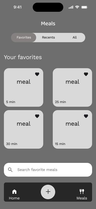
The final flow of low-fidelity wireframes is the meals tab in the bottom navigation bar. Users are able to view their favorites, recents, and all meals in this section of the app.
User views the meals tab:
User views their recent meals in the meals tab.
User views their all meals in the meals tab.
User enters their name and email address to create an account for the fifth and final step of onboarding.
Moodboard
The Mindless Meals moodboard reflects the kind of energy I want users to feel: calm, refreshed, and supported. Mindless Meals core values are practical, calming, flexible, inclusive, and relief. I drew inspiration from natural textures, cozy lighting, and real food moments that feel honest and unpretentious. The color palette and imagery bring together comfort and clarity, mirroring the app’s mission to make food decisions feel effortless.
Mindless Meals Style Tile
After finalizing the moodboard, I developed a style tile to translate the brand’s personality and core values into real design elements. The color palette marries earthy greens with soft neutrals to create balance and calm, while the rounded typeface Baloo 2 adds a friendly, approachable tone. Together, these choices guide the visual consistency across the app.
Logos
When designing the logo, I aimed to create a mark that felt friendly, grounded, and practical. The rounded letterforms of “Mindless Meals” convey softness while including a fork for the M to make it cohesive. The result is a logo that captures the brand’s core values.
High-fidelity Mockups
After testing the low-fidelity wireframes, I plugged in all the color and branding of Mindless Meals to best meet the brand’s core values. First is the onboarding flow, then the AI camera flow, and finally the meals tab. I then tested these high-fidelity wireframes into a prototype again.
Onboarding with Mindless Meals:
Mindless Meals get started page.
User opens the app to their dashboard and selects the “+” icon to open the AI camera.
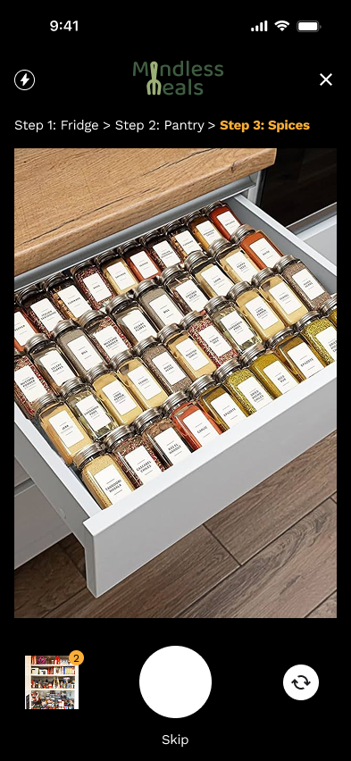
User takes photo of their spices.
Dashboard then the user taps the meals tab.
First step of onboarding is choosing dietary preferences and allergies.
Second step of onboarding is foods the user dislikes.
Fourth step of onboarding is dragging the lightning bolt to low or high energy for cooking.
AI camera pop up to let the user allow camera access.
User takes a photo of their fridge ingredients.
Loading page for the AI recipes.
Fifth and final step of onboarding is entering your name and email address to create an account with Mindless Meals.
Accessing the AI camera and adding a meal to favorites:
Meal is added to favorites.
Viewing the meals tab:
Recipes are produced from the ingredient images for the user to choose from.
User takes photo of their pantry ingredients.
User views their meals that they added to their favorites under the meals tab.
User views their recent meals under the meals tab.
Third step of onboarding is entering typical ingredients the user has on hand.

Recipe card once pressed showing details.
User views all meals under the meals tab.
UI Component Kit
Creating a UI component kit, helped establish a consistent and polished user interface throughout the designs of Mindless Meals. the components include, buttons, text fields, search bars, energy levels, recipe cards, pills, and more.

Low-fidelity Prototype, High-fidelity Prototype
Prototype
Low-fidelity Prototype
The low-fidelity prototype was designed in grayscale to ensure the user focuses on the elements rather than colors. The three task flows created in the prototype were: Onboarding, Accessing the AI Camera + Adding a Meal to Favorites, and Viewing the Meals Tab.
Flow 1: Onboarding with Mindless Meals
Flow 2: Accessing the AI camera + adding a meal to favorites
Flow 3: Viewing the meals tab
High-fidelity Prototype
After testing the low-fidelity prototype, I incorporated all the branding, color elements, and insights gained from the low-fidelity prototype testing. The three flows, from left to right, are Onboarding, Accessing the AI Camera and Adding a Meal to Favorites, and Viewing the Meals Tab.
Flow 1: Onboarding with Mindless Meals
Flow 2: Accessing the AI camera + adding a meal to favorites
Flow 3: Viewing the meals tab
User Testing, Usability Test Plan, Usability Test Results
Test
Usability Testing Summary
Overview
Mindless Meals underwent two rounds of usability testing to validate design decisions and uncover areas for improvement:
Low-Fidelity Prototype: Tested onboarding, AI camera + adding to favorites, and meal tab browsing.
High-Fidelity Prototype: Tested aesthetics, micro-interactions, and clarity of onboarding, AI camera upload + adding to favorites, and meals tab.
Participants: 5 per test, users prone to indecision when choosing meals.
Method: Remote moderated testing (Zoom).
Tasks Tested
Users tested the low-fidelity and then high-fidelity prototypes with 3 different tasks:
Onboarding: Complete signup and set dietary preferences.
AI Camera + Add to Favorites: Upload images and add a meal to favorites.
View Meals tab: Browse meals, favorites, and recents.
Low-fidelity insights
Task 1: Straightforward, simple, happy it wasn’t long. One participant wondered what happens if skipped steps.
Task 2: Easy to use; participants suggested swapping the plus icon with a camera icon; questions about number of images and spices-leading to adding more images of fridge, pantry, and spices in high-fidelity.
Task 3: Liked simplicity; liked meal times; some wanted profile/settings or explore integration; questions about “Recents.”
High-fidelity insights
Task 1: Clear and intuitive. Participants suggested minor refinements for health concern wording or separation. No confusion in flow.
Task 2: Camera icon more intuitive than plus; some wanted Instacart integration; adding favorites behavior as expected; very quick for indecisive users.
Task 3: Favorites visible; some suggested renaming tab to “My Meals”; participants generally found it intuitive; minor copy/label tweaks suggested.
Key Takeaways
1. Navigation & Flow
Both prototypes showed high usability; participants completed tasks quickly and intuitively.
Bottom navigation and task flows were easy to understand, with low cognitive load.
Minor confusion with icons (plus vs. camera) resolved with high-fidelity iteration.
2. AI Camera Feature
Strongly valued for saving time and reducing decision fatigue.
Participants suggested clarifying steps for multiple images (fridge, pantry, spices).
Adding visual cues (camera icon) improved discoverability.
3. Meals Tab
Simplicity appreciated; favorites prioritized.
Suggested enhancements: rename “Meals” to “My Meals,” add recents with timestamps, integrate “explore” or external inspiration sources.
4. Overall Impressions
High engagement and enthusiasm for AI-driven meal suggestions.
Users felt the app met their needs for indecision and low-energy scenarios.
Ratings for real-life usage: 5/5 across participants in high-fidelity testing.
Iterations & Improvements Made Between Lo-Fi and Hi-Fi
Replaced plus icon with camera icon for clarity.
Added health concern question refinement in onboarding.
Enhanced meal tab labeling for clarity (“Favorites,” “Recents”).
Visual polish and aesthetics (colors, images, typography) added for high-fidelity prototype.
Considered additional guidance for AI camera multiple-image upload.
Quotes from Testing
“Exactly what I would want when I am low energy.”
— Low-fidelity
“Visually perfect, simple and easy to use.”
— High-fidelity
“Much quicker than listing out every single ingredient, that takes too much time.”
— High-fidelity
“Couldn’t make it easier for indecisive people.”
— High-fidelity
Iterations, Reflection, Next Steps
Iterations + Reflection
To explore alternative ways to present meal suggestions and reduce decision fatigue, I used Figma Make to generate layout variations based on my existing wireframes.
AI-Assisted Exploration
AI Prompt
I prompted Figma Make to:
Reimagine my high-fi wireframe screen that presents personalized meal suggestions for users who feel indecisive or low energy. Include 3–5 meal cards with images, prep time, and simple labels like “quick” or “healthy.” The layout should feel calming, minimal, and reduce cognitive overload.
What I Explored
I generated multiple layout variations to evaluate different ways of presenting meal options, including changes in card size, structure, and information hierarchy.
Key Insights
Simpler layouts with clear visual hierarchy improve scannability
Larger, more spaced-out cards can reduce cognitive load
Additional labels may help guide decision-making
Iterations
Navigation & Layout: Bottom navigation bar vertically aligned and darkened; search bars moved to the top of screens for visual hierarchy; hamburger icon resized to 32px; back arrow and X icon repositioned above onboarding progress indicator.
Visual & Spacing Adjustments: Text inputs now have inner shadows; line height set to 28px; recipe screen spacing standardized at 16px; updated browse-by-mood pills to a larger shape; search bar fill color adjusted.
Interactive Elements: Added “Give Me More Ideas” to AI camera results for more meal suggestions; step added in onboarding: Any health goals or considerations we should keep in mind?; “View All” added to Today’s Meal Ideas; camera icon added to bottom nav for usability; favorites now unified with same color.
Buttons & Preferences: Dietary preference buttons outlined in orange; health concern added to first onboarding question with “Other” option; 50% width applied to All Meals tab.
Final iterated prototypes after testing:
Button is now the orange color when pressed as well as adding “health concerns” into the question.
The question of any health goals or considerations has been added to the onboarding process.
The AI camera icon is now a more intuitive camera icon instead of a “+"; the “give me more ideas” option is available if users want different meals recommended.
Search bars were moved to the top of the screens and every screen has a title of either “favorites,” “recents,” or “all.”
Flow 1: Onboarding
Flow 2: Accessing AI camera + adding a meal to favorites
Flow 3: Viewing the meals tab
Reflection
Overall insights
Through research and testing, I discovered that users prioritize speed and simplicity over extensive customization when facing indecision. Additionally, visual suggestions consistently outperformed text-based lists, keeping users more engaged and making decision-making feel effortless.
Challenges
One of the biggest challenges was narrowing features to a minimal viable product without overcomplicating the flow, while still addressing the overarching problem of decision fatigue. Another challenge was balancing variety with simplicity—offering enough options to be useful without overwhelming the user.
Lessons learned
Early low-fidelity testing proved invaluable, saving time and preventing wasted design work. It also helped users focus on the flow and functionality rather than superficial visual elements. I also learned that decision fatigue is influenced as much by emotional state as by the number of choices, highlighting the importance of a calming and intuitive interface.
What I’m proud of
I’m proud of designing a flow that allows users to discover meals using ingredients they already have, easing decision fatigue while sparking creativity. During usability tests, users completed tasks quickly and reported enjoying the experience, reinforcing the effectiveness of a calming, user-friendly interface.
Next steps
-
Integration of Tiktok for meal inspiration since users find it the most there.
-
A dedicated section in the meals tab for tracking previously cooked meals, giving users more ways to engage and find inspiration.
-
A possible streak feature for how many meals cooked at home to encourage users to get into the app daily.