
Hidden Safes Inc. Website Redesign
Redesigning a local business’s outdated website to strengthen its professional image, build trust, and ensure a lasting online presence.

The Problem
HiddenSafes’ outdated website made it difficult for customers to find and trust the company’s products. The design lacked professionalism, wasn’t mobile-friendly, and didn’t reflect the quality or reliability of the business, ultimately hurting credibility and customer engagement.
Project Overview
Background
HiddenSafes.com is a local business specializing in custom-built safes and secure storage solutions. While the company had an existing website, it had gone through two outdated redesigns that no longer met user needs or reflected the brand’s credibility. The site lacked a clear structure, modern visuals, and intuitive navigation, which made it difficult for customers to explore products and inquire about services. The business owner sought a new website that would strengthen trust, highlight offerings, and provide a seamless user experience.
Project: Responsive Web Design
Role: Head of Design- responsible for research, strategy, design, testing, and implementation
Timeline: May 8 - June 12, 2025
Problem
The existing HiddenSafes.com website was outdated, difficult to navigate, and lacked user trust. Content was poorly organized, the design didn’t reflect the professionalism of the business, and users had trouble scrolling through large product images, an unreliable contact form, and clunky, random stock images. It simply did not reflect the caliber of work that the company provides. Having gone through two outdated website versions, the business owner was ready for a new design that felt user-friendly, modern, and trustworthy.
Solution
Redesigned the website with a clean, modern interface and intuitive navigation to build trust and improve usability. Developed a clear information architecture, created a cohesive visual identity, and implemented the final high-fidelity design in Squarespace — making it easier for customers to browse products, understand services, and contact the business.
Constraints
This is a local business, so the owner approved Squarespace for the redesign, which brought some design limits I had to work around. Doing user research was tricky because both the owner and users value anonymity, which kept user interviews very limited and private. The previous developer wasn’t the easiest to communicate with either, which made transferring the domain and getting old assets a process. Plus, there’s not a ton of documentation of the old site, so showcasing what existed before was a challenge. All of this meant I had to get creative, prioritize what mattered most, and iterate carefully to make a design that worked for both the business and its users.
Before & After
After website redesign:
First is the original homepage before the redesign. A whole lot of stock images, the wrong color palette, and blurry images with text spelled wrong that doesn’t align with the business’ brand. Then is my redesign with a strong color palette with updated images and text that the owner provided.
After redesign mobile:
Before website redesign:
First is a screen recording of the products page before my redesign with blown up images. Then my redesign with a cohesive layout that is mobile friendly and easy to scroll.
Before redesign on mobile:
Design Process Overview
-

Competitor analysis, User interviews,
-
Affinity mapping, Storyboard, User personas, project goals, Problem statement, Feature set
-

Sitemap, User flow, Low-fidelity wireframes, brand style tile, High-fidelity mockups
-
Final high-fidelity prototype built in Squarespace, Screen recording walkthrough to demonstrate site functionality
-

Usability testing on wireframes and hi-fi mockups, Usability test results as summarized
-

Iterations, Reflection, Next steps
Competitor analysis, User interviews,
Research
Initial thoughts
The current website is outdated and might not reflect the brand’s expertise.
Users probably struggle to find information about different safe types or services.
The website should feel secure, professional, and trustworthy.
Navigation might be confusing, and users may want an easier way to request quotes or contact the business.
Initial assumptions
Users are primarily homeowners or businesses looking to secure valuables.
Users may not know what type of safe they need, so guidance and education are important.
Competitors likely have more modern and user-friendly websites.
A clean, professional design and clear calls-to-action will improve user engagement.
Users may prefer contacting via phone or a form rather than navigating complex menus.
Competitor Analysis
To better understand the market and identify opportunities for improvement, I analyzed 3 competitor websites’ strengths and weaknesses: tacticalwalls.com, libertyhomeconcealment.com, and snapsafe.com. My goal was to evaluate how competitors presented their products, structured their navigation, and built trust with potential customers.
Strengths Across Competitors
TacticalWalls.com: Strong branding, lifestyle photography, and product demos that build trust.
LibertyHomeConcealment.com: Friendly, family-owned brand voice with custom options for disguising safes.
SnapSafe.com: Detailed specs, biometric/tech-enabled security, and a strong reputation in firearm safety.
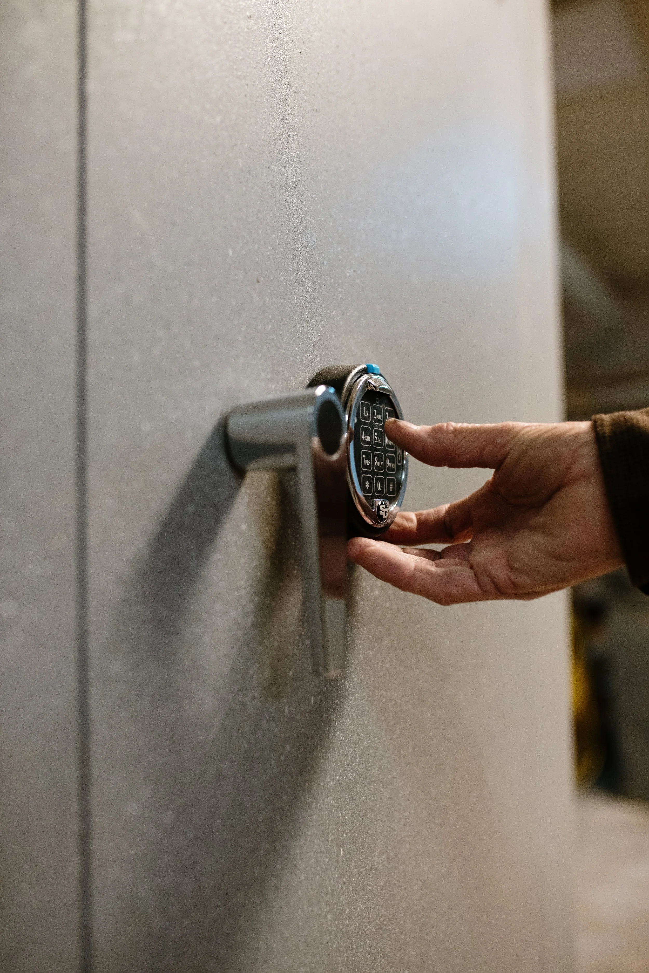
HiddenSafes.com: Truly invisible safes with magnetic entry, custom design, and premium craftsmanship.
Weaknesses Across Competitors
TacticalWalls.com: Products are still visible on close inspection; no fully custom installation.
LibertyHomeConcealment.com: Designs still recognizable as furniture; visuals lack polish compared to others.
SnapSafe.com: Safes are highly visible, with a commercial/functional feel and less personalization.
HiddenSafes.com: Current website doesn’t reflect premium quality; lacks eCommerce/quote request system and trust-building elements like testimonials and photos.
Key Learnings
Trust-building is crucial → Competitors leverage reviews, testimonials, videos, and detailed specs. HiddenSafes needs more of this to instill confidence.
Visual storytelling matters → Lifestyle photography and sleek product displays help products feel aspirational, not just functional.
Clarity + differentiation → Competitors highlight product categories clearly. HiddenSafes should emphasize its unique “completely invisible” advantage more strongly.
User experience gaps → Many competitors have cluttered or outdated visuals. There’s an opportunity for HiddenSafes to stand out with a modern, intuitive site.
Conversion pathways → Lack of eCommerce or smooth quote requests is a major barrier. Adding clear calls-to-action can increase inquiries.
User Interviews
I interviewed five users—three customers and two company employees—to gain a deeper understanding of user needs and perspectives. Key constraints included the users’ age (all in their 60s) and limited computer experience, as well as the customers’ desire for privacy due to the sensitive nature of the business. There were different sets of questions depending on if the user was a customer or employee. To accommodate these factors, all interviews were conducted in person and scheduled to be timely and convenient for the participants.
Research Goal
Uncover motivations, pain points, trust signals, and expectations of hidden safe owners, especially in the context of the current website
Research Objectives
Identify if there are usability or content issues with the current website.
Understand what users expect to find/experience when seeking hidden safe services online.
Understand why users want a hidden safe, their motivations, and how users make decisions.
Gather insights on what users wish could be different about the website or informations they are expecting to see.
Learn what creates of breaks trust
Key Insights from Employees
Customers are primarily motivated by protecting valuables such as jewelry, documents, and firearms, with security and discretion as top priorities.
Many customers are impressed by the seamless, hidden nature of the safes and value craftsmanship and secrecy.
Customers often discover HiddenSafes through referrals, word of mouth, or home shows rather than the website.
The website is rarely mentioned, but when it is, it’s seen as outdated and lacking clarity on pricing, fire ratings, and installation options.
Purchase decisions are typically made during sales calls or showroom visits, with price being less of a deterrent.
Key Insights from Customers
Motivations mirror those noted by employees: protecting valuables and maintaining privacy.
Customers value trust, professionalism, and personal communication, often preferring phone calls.
They expect the website to reflect the company’s quality work with clear contact info, updated photos, testimonials, and a polished design.
Current site issues include stock images, confusing forms, and lack of product categorization.
Customers want assurance of privacy, clarity on installation in existing homes, and a website that communicates legitimacy and custom service.
Overall Takeaways
HiddenSafes customers prioritize discreet, high-quality, and trustworthy solutions over price.
The website needs to better showcase products, provide clear contact options, and reflect the company’s craftsmanship and reputation.
Clear messaging and polished design will improve credibility and support customer decision-making without compromising privacy..

Affinity mapping, Storyboard, User personas, project goals, Problem statement, Feature set
Define
After conducting user interviews, I organized the insights using an affinity map to identify patterns, themes, and key pain points. This method helped cluster observations from both customers and employees, allowing me to synthesize the research into meaningful insights.
By visually grouping related findings, I was able to highlight common motivations, challenges, and opportunities, which directly informed personas, problem statements, and design decisions.
Affinity Mapping
Themes
Motivations and values
Items protected
Customer concerns/misconceptions
Decision making factors
Website feedback
Website wishes
Preferred contact method
Customer reactions to Hidden Safe after installation
Process for buying
Constraints
Features and customization
Storyboard
I then created two quick storyboards to illustrate a realistic user journey based on research insights. This narrative helps visualize how a user might interact with the website, uncovering emotional touch points, opportunities, and challenges.
Storyboard 1: Liza learns about Hidden Safes Inc. at a home show and visits their new and improved website and calls to purchase a custom safe.
Storyboard 2: James learns about Hidden Safes Inc. from a colleague and visits their new and improved website and fills out the new customer inquiry form to purchase a hidden safe.
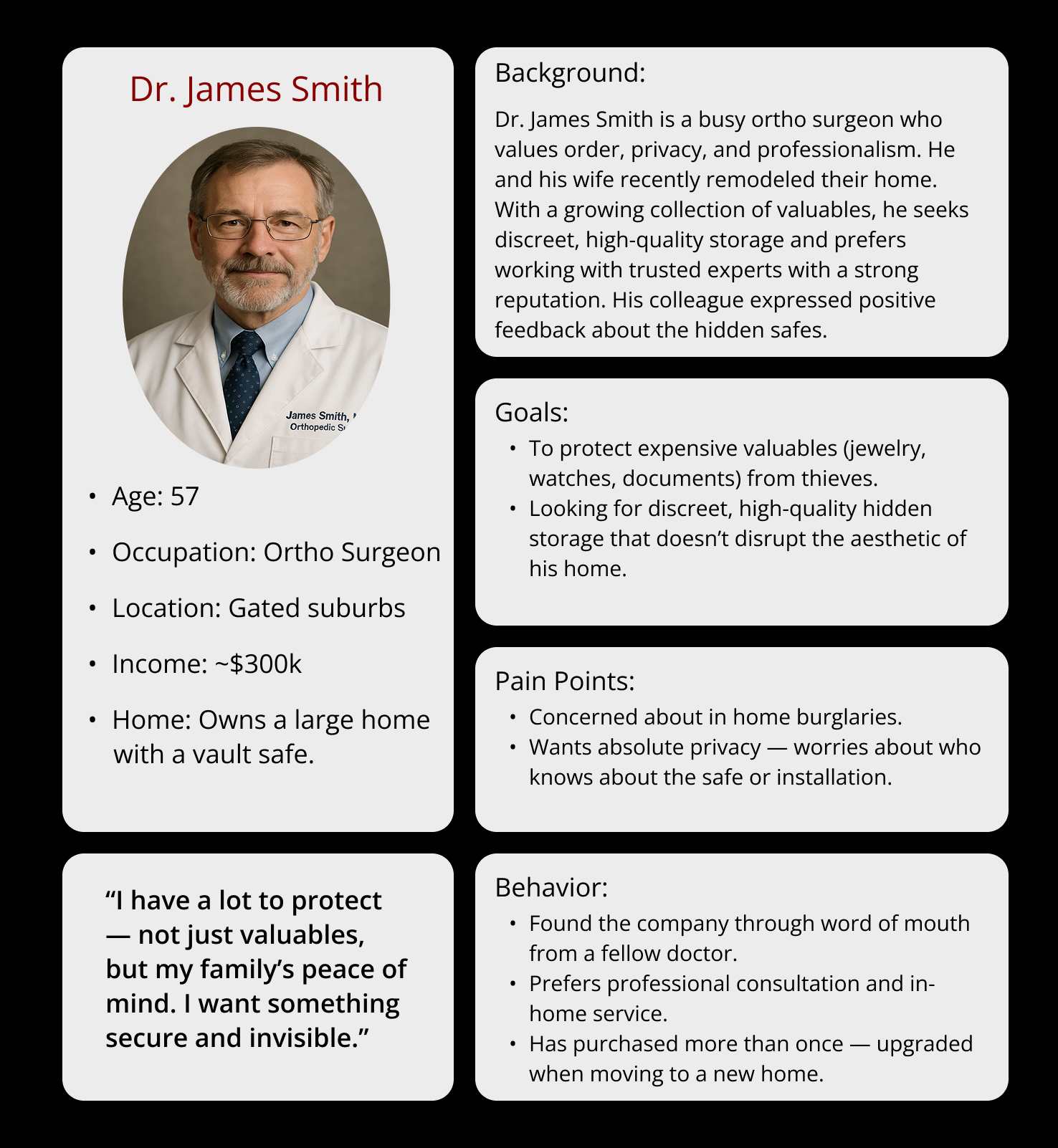
User Personas
Because this company has a variety of customers, I created three different user personas to get a better grasp on who this website was for to meet their needs and expectations.
Project Goals
To ensure the redesign balanced both the business objectives and customer needs, I mapped out business goals and user goals in a Venn diagram. This exercise helped me identify areas of overlap which were shared goals that represented the highest-value opportunities for the project. Focusing on these common goals allowed me to align the design direction with both user expectations and business outcomes.
Problem Statement
Hidden safe customers are looking for a secure, private, and discreet place to hide their irreplaceable valuables, because they worry about potential break-ins and theft. However, the current website is outdated, contains errors, and lacks key information which may cause users to lose trust, hesitate from contacting and ultimately prevent the business from generating new sales.
How might we…
How might we display the strong, long standing reputation of the company to build trust with potential customers?
How might we answer common customer questions directly on the website to reduce confusion and hesitation around purchasing a safe?
How might we communicate that Hidden safes prioritizes customer privacy and security through the site?
How might we encourage users to take action (contacting the business) without overwhelming them?
Prioritizing Features
-

Must Have
Homepage, Products Page, About Page, Testimonials, Contact Information + Location
-

Nice to Have
Social Media Handles, FAQ
-

Surprising and Delightful
Leave Anonymous Review, Videos of Products
-

Can Come Later
Product Tag Organization, Pricing, Photos
Sitemap, User flow, Low-fidelity wireframes, Brand style tile, High-fidelity mockups
Design
Sitemap
To create a clear structure for the Hidden Safes website, I developed a sitemap that organizes content into intuitive categories. The goal was to make it easy for users to learn about the company, explore product offerings, and quickly find contact information.
The sitemap reflects four main sections:
About – including company history to build trust and credibility
Our Hidden Safes – showcasing different types of products in an organized way
Testimonials – highlighting reviews and the value of anonymity, with an option to leave a Google review
Contact – providing multiple contact methods (phone, email, consultation form, and address) to meet different user preferences
This structure prioritized simplicity and ease of navigation, ensuring that both new and returning visitors could quickly access the information they need.
User flow
To better understand the steps a potential customer would take to contact Hidden Safes, I created a user flow that visualizes the process from landing on the homepage to submitting a consultation request.
The flow highlights two primary paths:
Exploring products before reaching out
Going directly to the contact form or using phone/email options
Mapping this journey helped me identify opportunities to streamline the process, such as keeping the contact form concise, making phone/email options prominent, and providing reassurance along the way. This ensured that customers could easily take action, whether they were browsing or ready to connect immediately.
Hand Sketches
I started designing with pencil and paper to draw out all the different layouts. I sketched out the homepage, footer, contact form, and product page before taking my ideas into Squarespace.
Homepage sketch with FAQ and testimonials:
Footer, products page, and contact form sketches:
Homepage sketch with nav bar:
Low-fidelity Wireframes
Taking my sketches into Figma at the lowest fidelity helped unravel the content and visual hierarchy the original site was lacking. The owner wanted text that made sense to his business and brand as well as a strong location of contact information. The original website was not the fullest potential it could be for mobile, so I designed wireframes for both desktop and mobile view.
Desktop homepage with hero section, CTA button, navigation bar, products, testimonials, FAQ, and footer:
Mobile homepage with hero section, CTA button, contact button, products, testimonials, FAQ, and footer:
Desktop products page with images of safes:
Desktop contact form:
Mobile products page with images of safes:
Mobile contact form:
Hidden Safes Style Tile
I created a style tile to set the visual direction for the site, covering fonts, colors, and UI elements. The palette reinforces trust and security: red shows confidence and strength, black feels sleek and high-end, steel grey adds depth, and white keeps things clean and readable. This helped keep the design consistent and on-brand throughout the project. I also had some photos that my sister took for the business a while back as well as old business cards to draw from.
High-fidelity mockups
These high-fidelity mockups are screenshots of the original designs implemented in Squarespace of the desktop view. They showcase the layouts, visual style, and functionality as they appeared in the live site, serving as a reference point for the redesign process. First is the homepage, then the products page, location, and contact.
Desktop homepage design in Squarespace with hero section, products, testimonials, FAQ:

Desktop products page with images of open and closed safes:
Location of where the business is located:
Desktop contact form:

Final high-fidelity prototype built in Squarespace, Screen recording walkthrough to demonstrate site functionality
Prototype
High-fidelity Prototype
Instead of creating a static prototype, I built directly in Squarespace, which allowed me to test functionality and design choices in a live environment with real users. Below is accessing the homepage, viewing products, and contact.
Usability testing on wireframes and hi-fi mockups, Usability test results as summarized
Test
Usability Testing
Objective: Evaluate how easily users navigate the site, understand services, and initiate contact.
Participants: 5 users (homeowners, security-conscious individuals)
Test Type: Moderated (remote or in-person)
1. Homepage First Impressions
Task: Identify what the company does and assess trust.
Observations & Insights:
All participants immediately recognized it’s about hidden safes. Visual cues like safe images and the “Our Safes” section were effective.
Users scrolled and clicked, indicating the homepage encourages exploration.
Trust and professionalism were noticed; participants suggested emphasizing testimonials and security features in the navigation.
Quotes:
“Good to know the business has been around 45+ years…you can build whatever your heart desires.”
“I’m more of a bullet-point person; testimonials in nav bar?”
2. Learning About Products
Task: Find product types and understand differences.
Observations & Insights:
All participants found the “Our Safes” section and navigated to products successfully.
Side-by-side images of opened and closed safes were appreciated for clarity.
Some confusion arose around custom options, hidden placement wording, and licensing requirements. Clearer labeling and descriptions are needed.
Quotes:
“The biggest seller is the customization.”
“It should say ‘behind a wall’ instead of ‘inside’.”
3. Contacting the Business
Task: Reach out for a custom safe installation.
Observations & Insights:
All participants found the contact button easily.
Users were split between calling and emailing, suggesting multiple contact options are valuable.
Form fields were clear, and participants experienced no hesitation while completing the form.
Quotes:
“Loved the form.”
“Call button in nav might be helpful.”
4. Trust & Legitimacy Check
Task: Evaluate credibility through testimonials, experience, and stats.
Observations & Insights:
All participants felt confident hiring the company, citing experience and a strong track record.
Suggestions included adding a “Testimonials” tab, more media mentions, and anonymous customer reviews to further enhance trust.
Quotes:
“Never a single loss, never subcontracted.”
“Add testimonials to the nav bar.”
Post-Test Feedback
Overall Impression: Professional, organized, and a significant improvement over the previous site.
Frustrations: None reported.
Highlights: Owner-focused theme, photography, and clear product presentation.
Comfort Reaching Out: All participants would feel comfortable contacting the company.
Missing Features: Showroom images/videos, ballpark pricing, FAQ details, and Instagram content.

Iterations, Reflection, Next Steps
Iterations + Reflections
Iterations
Although all user testing tasks were successfully completed, several iterations were made to improve clarity, usability, and trust:
Homepage Adjustments: The header and CTA button were nudged slightly upward so they are visible immediately upon page launch.
Testimonials Navigation: Testimonials were moved from the homepage to their own dedicated navigation section. A brief explanation was added to highlight the company’s commitment to customer anonymity.
Content Refinements: Text on the homepage (“Our Safes”), FAQ, and the “Our Safes” product page was revised according to the owner’s feedback for clarity and accuracy.
About Page Updates: The “As Seen On…” section was reorganized to better showcase media mentions.
CTA Alignment: The call-to-action at the bottom of the About page was updated to center alignment for improved visual hierarchy.
These iterations were directly informed by user feedback and aimed to enhance overall usability, trust, and clarity on the site.
Hero section CTA button moved up and navigation bar added testimonials:
Before iterations- CTA was too low and the testimonials were not in the navigation bar
Testimonials moved from the homepage to their own space in the navigation bar:

Homepage testimonials before iterations
After iterations- CTA was moved up and testimonials in the navigation bar
Navigation bar testimonials after iterations
Final High-fidelity Screens: Desktop + Mobile
These are all the final high-fidelity screens. Some text has been updated for SEO per request of the owner.
Desktop homepage:
Mobile products page:
Mobile testimonials page:
Mobile about page:
Mobile location page:
Mobile contact form:
Mobile homepage:
Desktop products page:
Desktop testimonials page:
Desktop about page:
Desktop location page:
Desktop contact form:
Reflection
Overall insights
Through research and testing, I discovered that users prioritize clarity, trust, and easy access to contact information when evaluating a security-focused business. Visual cues, professional photography, and clear product descriptions all contributed to establishing credibility. Users also valued testimonials and media mentions, which reinforced confidence in the company’s long-standing reputation and expertise.
Challenges
One of the biggest challenges was balancing business goals with user needs, especially working within Squarespace’s design limitations. Recruiting participants for research was also difficult, as many clients valued anonymity due to the sensitive nature of the product. Additionally, coordinating with the previous developer for domain access added logistical hurdles that required patience and professionalism.
Lessons learned
Collaborating directly with the business owner taught me how to advocate for users while still respecting client priorities. I learned the importance of clear information hierarchy, trust signals, and mobile-friendly layouts for building credibility. Working within platform constraints encouraged creative problem-solving, and handling sensitive user data emphasized the need for confidentiality in research and design decisions.
What I’m proud of
I’m proud of redesigning a website that effectively communicates professionalism and trust while remaining user-friendly. Users were able to easily understand product offerings, navigate to the information they needed, and reach out confidently. The addition of a dedicated testimonials section, reorganized media mentions, and clear CTAs directly enhanced user trust and engagement, demonstrating the impact of thoughtful, user-centered design.
Next steps
-
Incorporate updated professional photos throughout the products page.
-
Include video footage of safes opening and closing for a more interactive display of products.
-
Possibly add showroom images or videos to the Location page.